With the increasing digitalization of tools that can help our everyday lives, the need for software icons follows suit. Software and applications need something that can act as their “face” for consumers to distinguish. Making a memorable icon helps consumers remember what your software does and what it can offer them.
There are a few things to take note of when making an icon for your software. This article will tell you what they are and include a few tips and tricks for making an eye-catching and distinguishable icon that will last in the memories of those who see it.

What Are Icons?
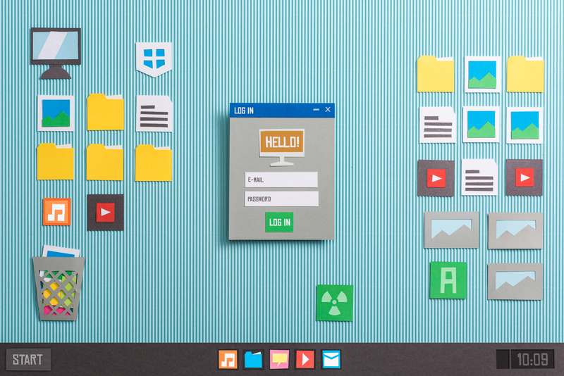
Icons are images representing an application or capability with clear meaning for its users. They help users identify an application quickly and easily, making them more prone to use the software due to its clarity. Think of the recycle bin icon, for example. The image of a trash bin immediately makes you understand what it is used for.
Why Are They Important?
Icons are images that tell users what to expect from an application or software. If your icon doesn’t look convincing or isn’t clear enough, people are more unlikely to use it. Making them distinguishable and unique makes them stand out from your competitor’s applications as well. It makes them more likely to remember your product and use it again.
Creating Good Software Icons: Do’s and Don’ts
Below is a list of things that you should be aware of before designing an icon. Let’s take a look.
-
Make Sure It Is Discernible
Visual legibility is key when designing an icon. An icon should be, first and foremost, distinguishable. Making it easy to understand helps users figure out what software does. A clearly designed icon makes it easier to find in the sea of other software with different icons.
-
Make Icons, Not Images
While icons are technically images, they are not a photo in a box. Icons need to be highly visual and recognizable. They are more of a graphic representation of an idea rather than just a regular image. An icon can consist of an image, but it should be taken into consideration that it may be difficult to read in smaller sizes.
-
Avoid Words
There is just not enough space for a bunch of words to fit in an icon. You should avoid putting in the text unless it is a part of your logo. If you end up using text, make sure the icon doesn’t look too cluttered and unreadable. Try to convey what your software or application does through visual elements alone.
-
Use Vibrant Colors
Using vibrant colors helps make your icon stand out on various kinds of backgrounds and grab people’s attention. Use them as your main color, then combine them with accent colors to give a nice touch to your design and separate your icon from others.
-
Think Out of the Box
Trends always come and go. As tempting as it is to follow the current trend, don’t be afraid to try something different. This will help your icon stand out even more and become memorable to users. Perhaps you’ll even be able to start a new trend instead.
What Makes an Icon Memorable?
Generally, icons are memorable when they are designed in a way that is easy to grasp yet is filled with uniqueness that can be traced back to the company or developers behind them. Make them understandable for everyone but make them exclusively “you”.
This isn’t exactly an easy task, but it will be rewarding for you in the long run. You can play around with color theory and incorporate the values your company holds in your icon if you want. Be creative and make users know that the software you create exists.
However, it’s important not to get carried over and sacrifice the clarity of your icons for their uniqueness. Easy-to-understand designs are what makes users want to use the software associated with them in the first place. Unclear icons will just leave potential users confused and look for a better alternative.
An Afternote
Memorable software icons help users distinguish your software from other similar ones. Good harmony between practicality and aesthetic values can surely create an eye-catching and memorable icon for your users. You can look for examples of ready-made icons to get inspiration. Happy designing!


Customer questions & answers