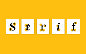
Ever since the day printing was introduced for the first time, serif fonts have existed. They are actually the most basic typeface—with a small dash at the end of each character as their known main trait, making them very generally used in any projects of design. As a matter of fact, a lot of designers have been counting on fonts to give the most proper look for any purposes, such as logos, signage, prints, ads, and many more.
We will bring up the critical guide to a great pairing of the series in this article. However, before we get to that part, let’s find out more about the vintage-styled font.

The Typography Anatomy
First of all, what is typography? It is actually the style in which text is presented to the audience. The right typography is important to involve the target audience in comprehending the content.
The anatomy of typography depicts the elements in a visual way to present the letterforms of a typeface. A typeface designer would create a font based on several elements that make up its readability and look as a whole. The essential elements (known as the anatomy) of the typography are as follows:
- Typefaces and fonts themselves (based on a set of characteristics such as size, weight or thickness, width, and shape).
- Varieties of the typeface. The four fundamental types are script, decorative, sans-serif, and serif fonts.
- Kerning, leading, and tracking. The three are all aspects related to spacing.
- Consistency. Applying consistent text colors and backgrounds can help readers ‘bridge’ between different sections.
- Color schemes. The appropriate font colors will make the text look captivating and deliver the right messages.
- Hierarchy. It is the order in which different text pieces should be showcased on a medium.
- White space. Also called negative space, it is in fact the space surrounding the text as well as the images. Using an adequate amount of white space eases up readers to read and comprehend the connections among the different text parts.
Recommended Pairings Based on Different Uses
If you plan to do font pairing—in this case, with serif fonts, it is basically a great decision as it contributes to the formation of a great design. However, finding a great font to be paired with a serif font is not as easy as it may sound. First of all, get to know the purposes of the uses in which your design is made. This means, which medium are you placing the fonts on—invitations, magazines, web designs, or art galleries?
Next, find your target audience, which is, of course, related to your content. For example, entertainment content is generally more for the younger audience. Font pairing is perfect for many purposes, infographics, postcards, logos, presentations, and so on. Then, understand the ‘science’ of font pairing: serif fonts are usually for body text, while sans serifs, scripts, or decoratives are for headings or subheadings.
Below are some of the best font pairings based on different uses:
Design Catalog
For interior design catalogs, a modern sans serif font like League Spartan is suggested for the heading as it has strong, geometrical forms. Meanwhile, a serif, Libre Baskerville, can be its companion as the body copy due to its traditional and elegant style.
Mediterranean Food Review
A combo of classical Roman and contemporary style, Cinzel coming in all-caps, is excellent if paired with Quattrocento and Lora which have soft strokes. The trio of serif fonts in different styles is a graceful way to deliver culinary reviews from Mediterranean countries such as Greece, Kosovo, and Portugal.
Lifestyle Magazine
Another great example of pairing between a sans and a serif: Source Sans Pro and Source Serif Pro, which can go along harmoniously. The duo creates both hierarchy and balance at once, making them look pretty stylish for lifestyle magazines.
Can Two Serif Fonts be Paired Together?
Yes, they can. Nonetheless, choosing two different basic types of typeface is wiser since it may elevate the style of your whole design. If you really have to combine between two serifs or more, get them in very different types of serif font—or more or less very similar (as you can see from the previous pairing for Mediterranean food review).
In conclusion, whether you opt for elegant and traditional serif fonts or the more modern ones, you have to aim for your brand face. Therefore, the ultimate guide to great font pairing is to choose wisely. Also, remember that if you need great fonts to use on your design, you can go to the official website of Aqr Studio.


Customer questions & answers