Are you looking for some fonts that go great with your magazine designs? Yes, it is sometimes quite a challenge to choose the right editorial typography as it is the key to whether or not people are willing to read your magazine. Nevertheless, you will find the one here in this article—and serif fonts are our focus. First, read the section that explains why you need a serif font for your mag designs.
Why Choose Serif Fonts?
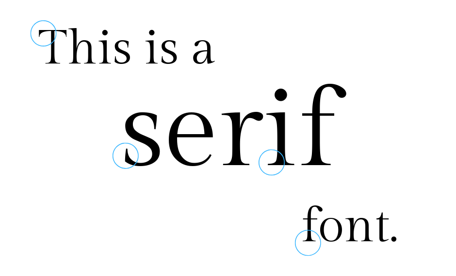
As most of us might have known, serifs are small lines attached to alphabetical characters. The reason behind the existence of serif fonts remains a mystery, but there is a theory in the fonts that appeared once upon a time when penmen used quills or brushes and left small "tails" as they finished every scratch. That has since evolved into intentionally adding a smaller "tail" at the tip of each line in more aesthetic ways.
The impression a serif font reveals is trustworthy, professional, and knowledgeable. Prominent institutions like The New York Times usually use one of the old-fashioned serif typefaces such as Times New Roman. The Time magazine, which generally focuses on politics, also uses Times New Roman, while Bloomberg Businessweek prefers Helvetica or Neue Haas Grotesk, which are sans serifs.
Meanwhile, high-end magazines such as Harper's Bazaar and The Interview use Theano Didot and/or Bodoni, which are also serifs to make titles about fashion look more stylish, posh, and ageless.
You would also choose serif fonts when designing a book about a history or a biography of a legend or an inspiring elder. The fonts give off an institutional, formal, and objective feel to the whole design. With the font, readers will be brought back to the era before modern life began.
Serifs are not merely artistic; they are also great as body copy. At a smaller size and on a print, the typeface offers more readability as it helps you differentiate among the entire letterforms. It also adds flow while you are reading the whole line.
5 Appealing Serif Fonts for Magazine Designs
Numerous websites offer designers serif typefaces—free or premium, such as Aqr Studio. Nevertheless, before selecting the one you need for your mag designs, the first thing is to ensure the font's level of legibility. Just keep in mind that functionality is the main priority over appearance. Indeed, each font has its role—all you have to do is choose the one that fits your project.
Below are the five appealing serif fonts you can download:
Pioggia
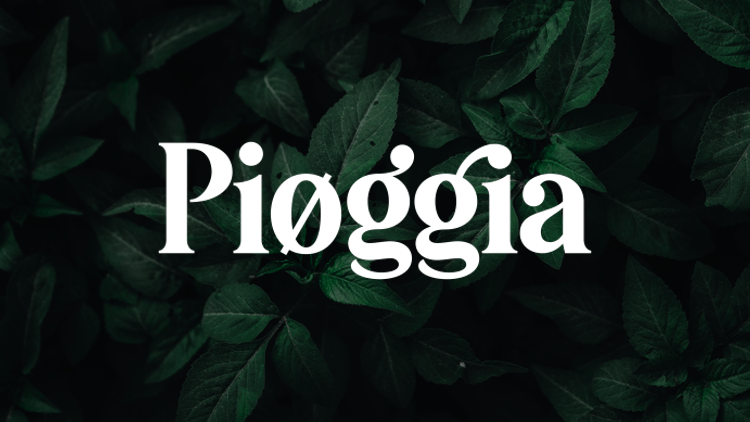
There are copious serifs to be downloaded out there, but for your journalism magazine that focuses on being youthful, Pioggia is a great choice. Being playful and modern, the serif font has lovely details, allowing you to have fun with its different characters. The multifunctional typeface is one of the top options for mag covers and headlines.
Brioche
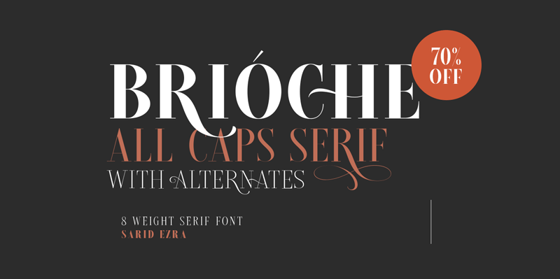
Vogue and The Harper's Bazaar use this beautifully unique font with very different types of strokes—the thin and thick ones. As a classic, modern serif font, Brioche has many alternatives, making it look incredibly elegant. This gorgeous font with extra long "tails" is one of those serif fonts that suit fashion-mag headlines and covers.
Elegant Karin
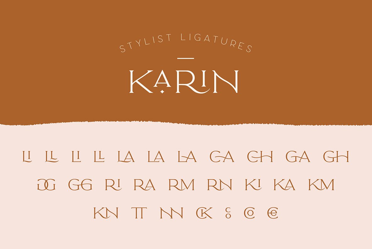
Still, for your mag's headlines and covers, Elegant Karin is a serif font with a vintage style. Its minimalist characters, gorgeous glyphs, and ligatures are special combos for any fashion and/or lifestyle magazine.
Theano Didot
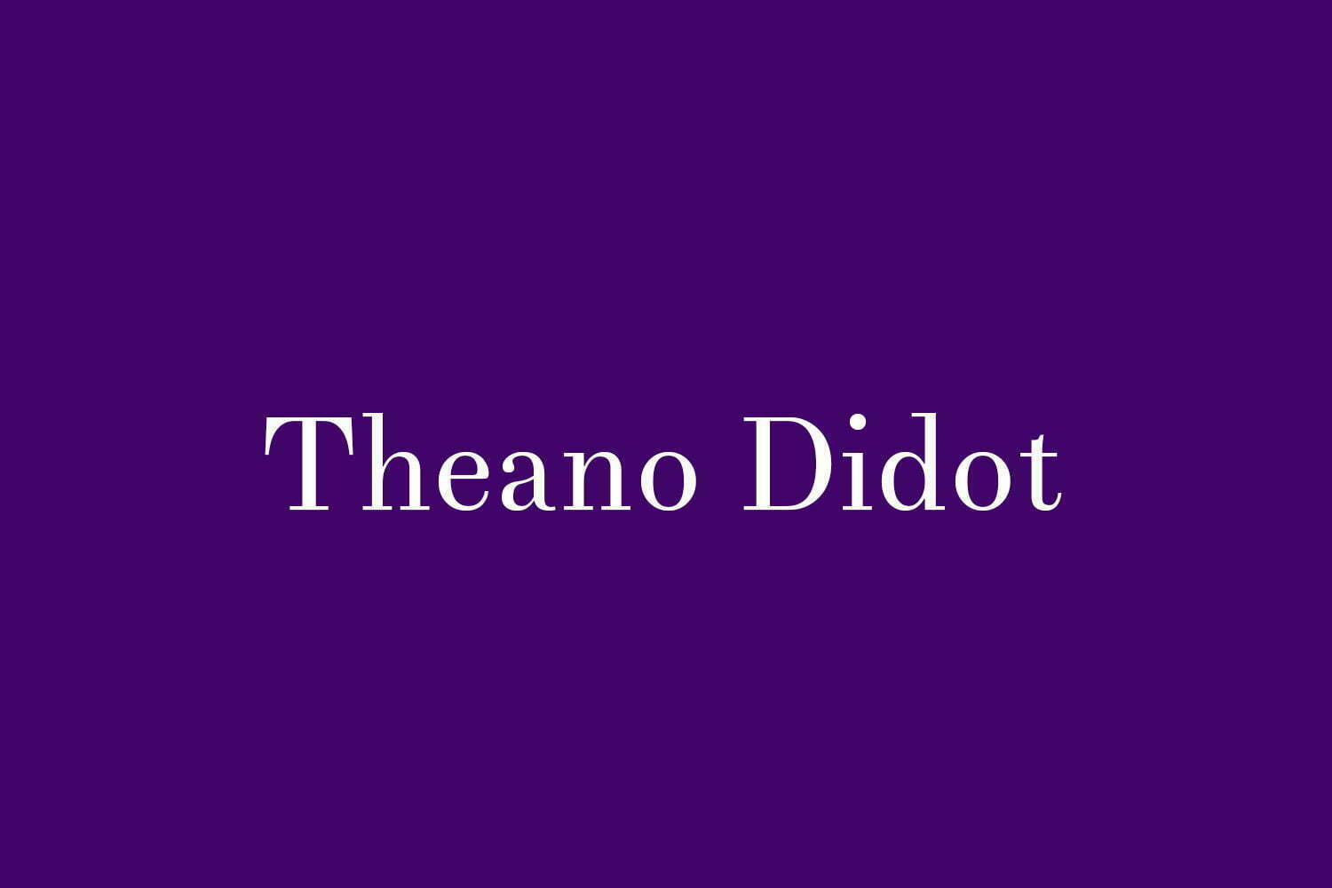
Revived from the Didot typeface, Theano Didot is one of the early 19th century's modern serifs. The font designed in 2007 is actually a part of the Theano trio, including Didone and old-styled serif. As mentioned, Theano Didot has been used by The Harper's Bazaar mag to make titles or body texts look elegant and luxurious.
Madelin Serif
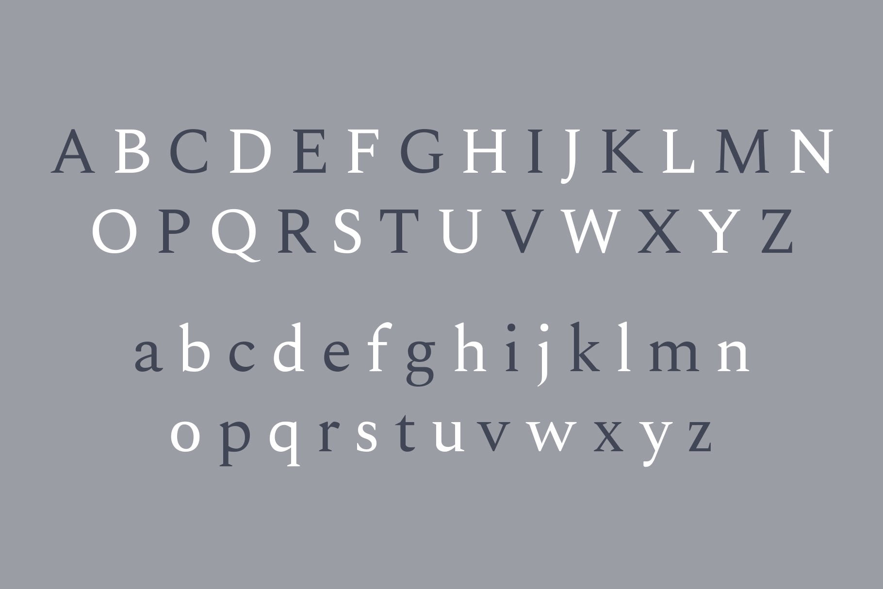
Madelin is also one of the serif fonts perfect for body copy. Coming in the regular version and five weights, Madelin is very clear to read at small scales. With shorter and more straight "tails" at the end of the thick lines, the font also comes in heavier weights that can be used as headlines or cover texts. The web version of the font is also available to make your mag design online.
So, have you decided which one of the serif fonts recommended above to complete your magazine designs? Don't forget to visit the official website of Aqr Studio for other appealing typefaces, such as sans serifs and scripts.




Customer questions & answers