Business branding is important if you want to advertise your products and services. It can establish a significant and differentiated presence in the market that attracts loyal customers. Creating good branding will give you lots of advantages against your competitors and attract more consumers in the long run.
Serif fonts are often used in company branding. They have characteristics that can convey what a company is all about. Are you perhaps looking for one yourself? This article will list five elegant fonts you can use to complete your design and give them a dashing look.
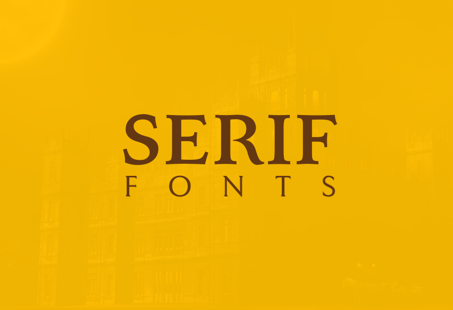
Serif Typefaces and What They Are
Before using them, it’s important to know what they are. Serif is a type of font that has decorative lines or tapers. Some may be subtle, while others are obvious. The extra strokes aid in readability as each letter becomes more distinguished when put side by side.
Serif typefaces can generally be categorized into six types.
Modern serif typefaces date to the late 18th century. They are characterized by their distinguishable difference between the thick and thin strokes of their letters. Examples include Bodoni and Walbaum.
Old style serif are the original serif typefaces. Newer typefaces based on these original fonts are still categorized as old-style fonts despite being “new”. Examples include Galliard and Palatino.
Transitional or baroque fonts’ development dates to the mid-eighteenth century, when improved printing methods made it possible to recreate fine strokes. This improvement created a whole new kind of font that is still used today. Examples include Baskerville and Utopia.
Slab fonts are distinguished by their thick and rectangular serifs. They are often bold and are designed to attract attention instead of being used in large blocks of text. Examples include Clarendon and Courier.
Blackletter fonts, also called Old English or Gothic fonts, are recognizable by their ornate appearance. They are often used for certificates or as initial caps. Examples include Luminari and Goudy Text.
When Should You Use Serif Fonts?
Serif typefaces are best used when you want to convey feelings of class and heritage. They are perfect for you if you want your company to feel “established”. They are also perfect for brand identities that revolve around authority and grandeur due to their classical nature.
Serif fonts work best in formal situations. They’re great for companies who want to demonstrate their trustworthy nature through their branding. Serif typefaces are a popular pick for financial companies, academics, and editorials.
Elegant Serif Typefaces for Your Business Branding
Now that you’re aware of their strengths and uses, here are our recommendations for fonts for your company’s branding.
-
Nimbus Roman No 9
Nimbus Roman No 9 is a font that works well when you want to add sophistication to your design. It looks similar to Times New Roman yet different, bringing the classic font’s well-known characteristics while also being unique on its own.
-
Minion
Inspired by the late-renaissance era, Minion is a font that was created by Adobe Systems in 1990. The font was intended for body text with legibility as its utmost priority. Balanced and clean, the font is great for conveying important messages that need to be gotten across.
-
Bookman Light
Bookman Light was inspired by a similar font created in 1860 by the name of Bookman Old Style. Its legibility and the classy feeling it gives made its popularity rise in the 1960s and 1970s. If you want to convey reliability without being too heavy, then this font is for you.
-
Voga
Voga is a font created by Charles Daoud. The distinguishable feature of the font is the creative mix of contrasting straight lines, corners, and curves in its letters. The font is great for formal invitations that benefit from its classy look or large headings in editorial layouts.
-
Fenix
Designed by Fernando Diaz, Fenix was created to look good in both titles and long text. The font has a classic style and only one weight in capital and lowercase letters. If you’re looking for a font that looks great on both printed media and digital screens, then this font is for you.
Those are our five recommendations of serif fonts that you should try. Keeping in mind what kind of image you want your business to have and using the right font for its branding is key to getting more consumers. So, what are you waiting for? Begin your next project now!




Customer questions & answers