"Aesthetic design" does not stop with arts and interior design. Presentations made with Google Slides can be an excellent tool for incorporating the aesthetic design. The features in Google Slides make it easy for you to incorporate unique colors, images, and fonts that match your favorite aesthetics.
You can incorporate aesthetic designs into a presentation while staying professional. The key is matching the visual elements with the goal of the presentation. This guide will help you do it.
What is the Aesthetic Design Trend?
Currently, we see people sharing photos, artworks, and digital arts and calling them "aesthetics". The question is: what do they actually mean?
In the design world, aesthetic refers to the visually pleasing quality of a concept, artwork, photograph, or other visual products. However, it does not always refer to artistic works we make. Natural sceneries, images of buildings, or even everyday objects arranged on the table can be something aesthetically pleasing.
Aesthetics in designs come from the perfect balance between elements such as colors, shapes, and textures. An aesthetic design may have practical functions, but it first draws the eyes because of its visual beauty. This is the opposite of practical design, which emphasizes the functional aspect.
You can apply this principle in Google Slides presentation by creating a well-balanced design. Choosing specific elements to make the slides beautiful and functional will make your presentation more attractive.
Elements of Making Aesthetic Design
When making aesthetic design, regardless of the object you are working at, make sure to incorporate all the elements, such as:
Colors
Colors play vital parts in aesthetic design. Colors evoke certain emotions, from energetic to relaxing and cute. Certain aesthetics combine colors to create associations about specific topics or objects in people's minds. Choosing the right colors contributes to your aesthetic design by delivering the message correctly.
Fonts
Slides ideally have limited numbers of fonts to use for a professional presentation. They help distinguish different sections, but too many fonts can distract your audience and make your slides look crowded or messy. Presentation fonts should uphold function over style, but you can still make them work with your design.
Patterns
Patterns can work as accents, background, or main visual elements, depending on your design. On presentation slides, patterns can provide creative ways to improve the slide design without adding unnecessary pictures or images.
Shape
The shape determines how a particular object will be perceived against the background space or other objects around it. The shape is the basis of many elements of your presentation design, from image placeholders to charts and tables. The shape also determines the style of an image used to decorate the slides.
Scale
Scale in design refers to relative sizes between objects, which can also be used to compare design elements. Understanding the perfect scale is essential to creating aesthetic and readable presentation slides.
Value
Value is the element of darkness and lightness in colors. It would help if you considered how certain colors look when you pair them or change their gradient. Like how the psychology of colors affects perception, their values also matter in creating specific visuals.
Balance
Balance is the point of a perfect aesthetic design. Since aesthetic design creates a harmonious feeling between all elements in the viewer's eyes, you need to balance every aspect, such as scale, color combination, font use, texture, and negative space.
How to Incorporate Aesthetic Elements in Google Slides
As described in previous sections, incorporating aesthetic elements in Google Slides is about the balance between style and functionality. Aesthetics may come in different forms, but you can create the aesthetic you want by following these steps:
Understand the Topic and Audience
Presentation topic and target audience determine the way you deliver aesthetic design. Ask yourself: what is the tone of the presentation? What message do you want to deliver? What is the demography of the audience? They will determine the visual elements you want to include in the slides.
Understand the Subjective and Objective Visual Appeals
Visual appeals can be drawn from subjective and objective elements. A subjective appeal may come from your personal choices of colors, shapes, motifs, fonts, and other aspects of design. However, there are objective visual appeals, and they rely on two things: popular views on beautiful designs and design theories.
In popular views, you must consider what is considered "good" by most of your audience. Pastel colors may be soft, calming, and beautiful, but a certain audience may think it lessens the impact of your presentation. Bold contrasting colors are solid and impactful, but there are presentation topics where these colors are not suitable.
Understanding design theories is another key to achieving objective visual appeal. Even the basic ones can make a difference, such as the golden ratio, Gestalt principles, and the rule of thirds.
Draw Main Visual Elements of Your Topic
Make a list of visual elements that are connected to your presentation topic. For example, if you talk about environmental issues related to the ocean, the details may include various shades of blue and images of sea life. Talk about culinary businesses such as coffee shops. The dominant colors might be different shades of brown, alongside streaks of bright colors and images of coffee or café utensils.
Compose a Color Palette
If you do not want to use the default slide set, you can use your own based on a specific color palette. Create a color palette that consists of one background color and two or three accent colors. Since they are immediately visible, the colors will make or break your aesthetic Google Slide design.
Choose a basic, brighter version of a color to serve as the background. Your fonts must be visible and readable when you add the texts. As for the accents, use them in infographics, text bubbles, or other more minor elements. Make sure they are consistent until the last slide.
Want to really hammer down the modern aesthetic look? Try using a soft color palette. Go with mostly light versions of your chosen palette or even pastel.
Pick the Right Slide Ratio
The perfect slide ratio will make your presentation visually balanced and easy to read. Generally, a 16:9 slide ratio is ideal for conferences or other events. Meanwhile, the 4:3 ratio is perfect for presentation slides that will be seen on multiple devices.
Give Way for Negative Space
Avoid the urge to fill negative space with texts or images. A good presentation slide should not be crowded since it only serves as a visual guide for the speaker. Allowing negative space on your slide prevents clutter and creates an "airy" touch on your slide. It is perfect for creating an aesthetic design because it is relaxing for the eyes.
Modify from the Master Slide
After nailing all the aesthetic design elements, you can modify the Google Slides from the master slide. It helps you work more quickly; any change you make in the master slide will affect the entire slide.
Check How It Looks on Multiple Media
Consider where your presentation slides will be seen. Your aesthetics may look good on the conference or office presentation but probably do not read well on Zoom, website, or mobile device. Check if the color combination, patterns, fonts, and background you use do not tamper with the audience's ability to see them.
Run a Trial Presentation
Try doing a short version of your presentation in front of an audience you can trust, like coworkers and partners. They can give you a more objective opinion about how your presentation looks, especially with the specific aesthetics you apply on the slides. Ask them not only about your presentation skills but also what they think about your slide design and how it fits into your topic.
Aesthetic Inspirations to Include in Google Slides

Not knowing where to start when making aesthetic presentation slides? Here are some inspirations you can apply to your slides.
Soft Grey with Professional Photos
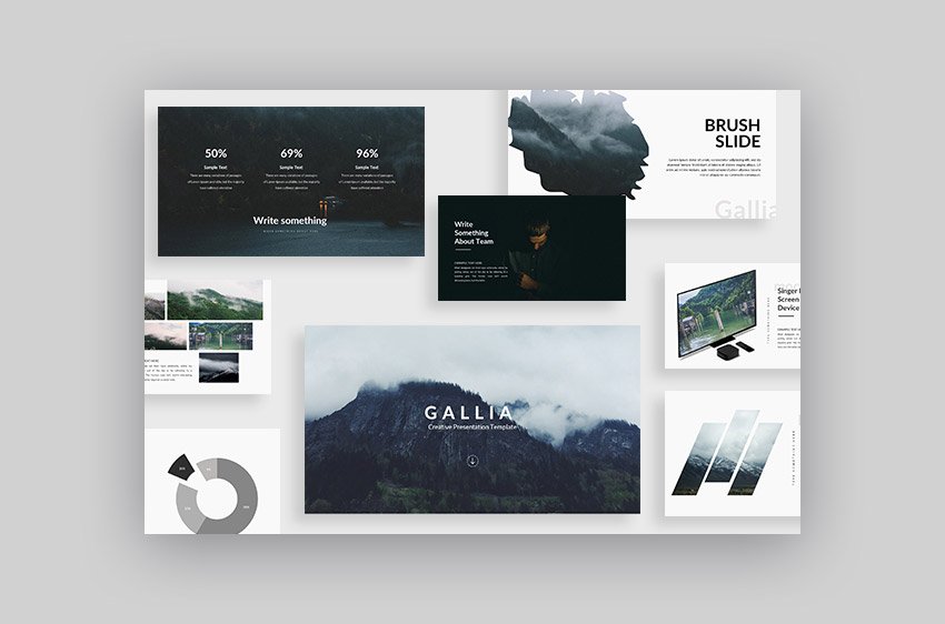
Combining high-resolution photos with a white and soft grey palette on your slide creates a simple but great aesthetic. This combination is both professional and elegant in a modern way. Adding a soft grey frame around the photos can make the slide more attractive.
Brown Vintage Aesthetic
You can create a modern vintage aesthetic by using soft brown colors and lines with curved edges to frame your texts. You can also use vintage typefaces for slide titles but stick with standard, legible fonts for the primary texts. Add little images to support this aesthetic, like old-timey cameras, old maps, polaroid photo frames, etc. However, these images should not distract the eyes.
Pastel Background Textures or Motifs
Pastel background is excellent for a simple aesthetic design that does not interfere with your presentation content. Use textures or motifs on your pastel background if you want to improve it. Make sure the textures or motifs match the theme of the presentation—for example, water ripples for the sea-related theme or paper texture for literature.
Color Blocking Accents
You can make a slide more beautiful by using color-blocking accents. Even without using images or vector arts, these accents will make your slides more eye-catching. You can put them in the corners, use them as backgrounds for related vector arts, or turn them into a transparent background.
To nail down the aesthetic element, pick the colors that support the theme and presentation topic you deliver.
Nature Aesthetic
Nature is an excellent inspiration for aesthetic design, and it includes presentation slides. Using soft green as the primary palette is already refreshing for the eyes. You can add vector images of natural elements such as leaves, trees, or flowers. However, if they are not parts of your presentation topic, keep them minimal and not distracting.
Geometric Shapes
Geometric shapes add to aesthetic design without distracting the audience with unrelated images. You can use them as accent images or backgrounds, turning them into decorations in a more discreet way.
Tips to Balance Aesthetic and Function in Google Slides
Since Google Slides presentation needs to be informative and precise, you must balance aesthetic design with function. Use these steps to make sure that these two elements are balanced:
Make the Design Thematic
Thematic presentation slide design allows you to be consistent in styling. You can connect the thematic design with your presentation topic. This way, you can create an aesthetic design that adds relevant visual weight to the slides.
Adorn Infographic/Chart Slide
An infographic or chart is a form of data visualization. It is essential to add legitimacy to your explanation. Google Slides templates usually have built-in infographics. However, you can adorn the data visualization slide to create attractive but functional slides.
For example, use whimsical icons that reflect the objects described in the infographic. You can also modify the colors of the data visualizations to match the aesthetic design.
Use Display Font with Personality
Display fonts can add personality and support the aesthetic element of your presentation. Use them not only as the main presentation title but also as the title of each section. However, ensure the section title is less decorative or garnish than the main one. People who work in creative industries usually can get by with aesthetic presentations like this. However, you probably should not do it for crucial presentations, such as toward prospective investors.
Use Pre-made Google Slides Template
Many pre-made Google Slides templates come with a beautiful aesthetic design that you can easily modify. The pre-made template also comes with features like picture placeholders and universal design, making it easier for you to change them into the presentation style you love.
Creative Google Slide Template, for example, is a bright, cheerful, yet professional template. The slides have a modern look, stylish infographics, and professional-looking image placeholders. Minimal Google Slide Template, another great example, exudes freshness with its soft color palette and simple white background.
Creating a Google Slides presentation is more than just inserting texts and data into your slides. Using aesthetic design can make your presentation pop, but you must ensure that the style and function elements support each other. Start modifying your Google Slides and create the best aesthetic slides for your successful presentation.





Customer questions & answers