To be an iconic logo, it does not necessarily fully detailed, complicated, or even difficult to make. There are a lot of brands that have simple company logos known by many people. Some even cost very cheap and are designed by non-professionals like college students.
Apple Tech Company
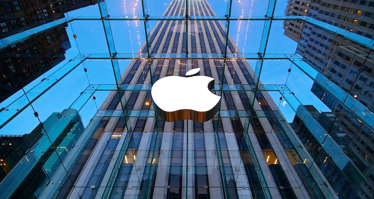
Nothing fits more perfectly than the apple fruit as the logo of a company called 'Apple'. Apple is a tech brand that has slowly transformed into a luxury brand due to its highly-priced devices. The bitten apple logo on an iPhone or a MacBook shows a sign of prosperity to the device's owner.
The bitten apple logo of Apple is one of the most well-known brand logos in the world. The logo is both simple and recognizable, but it was more detailed and not as simple in the earlier stage of the brand.
The first Apple logo in 1976 is nothing like the current logo. The logo is a picture of Isaac Newton sitting under a tree and an apple while reading a book. It was designed by one of Apple's founders, Ronald Wayne, and it did not look like a logo from a tech company. Unsurprisingly, the logo was changed in 1977.
The iconic bitten apple logo has been used since 1977. The changes were mainly just the color and the texture. At first, the apple was rainbow-colored, then changed to black in 1998. After that a silver color has been used since 2001. It was changed into a simpler two-dimensional texture in 2017
Apple was founded by Steve Jobs, Ronald Wayne, and Steve Wozniak. It is believed that the name 'Apple' is simply because Steve Jobs liked apples. The bitten part is because the founders did not want the logo to be mistaken for a cherry.
McDonald's Fast Food Chain

When you are driving or walking on the street and see a giant yellow 'M’ shaped thing on top of a pole, you suddenly feel hungry. That is because you see the iconic logo of the biggest fast food chain in the entire world, McDonald’s.
The logo of McDonald’s is straightforward and reflects the company's products, which is fast food. The ‘M’ shaped golden arches logo, as the logo is usually known for, looks like it is formed by two pieces of french fries, one of the most popular items from the restaurant's menu.
The iconic golden arches were introduced in 1960. At that time, the golden arches are accompanied by the restaurant’s name. The writing was removed in 2000, and in 2003, the slogan “I’m lovin’ it” was written in lowercase. Then, in 2006, the logo of McDonald’s is only the golden arches until today.
Nike Sports Brand
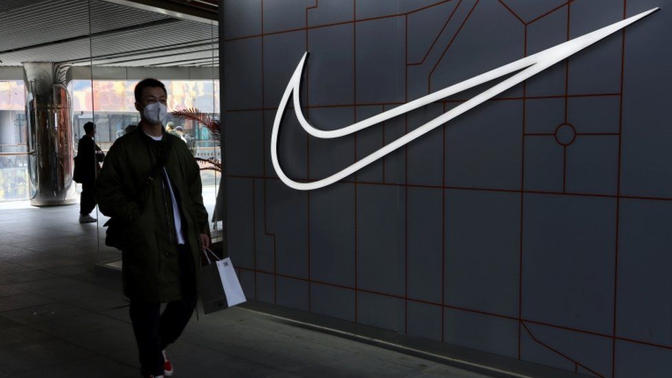
There are only a little number of brand logos that are as simple and successful as Nike’s. This giant sporting brand has a smooth logo that every people around the world know. Surprisingly, such an iconic logo was not necessarily expensive initially. The logo only cost the company $35.
A graphic design student of Portland State University, Carolyn Davidson, is the one responsible for the existence of the iconic logo. The then-called Blue Ribbon Sports asked her to design a logo for a new Nike brand. She was willing to do it cheap as she needed additional money for her study.
Little did she know such a low-priced and very simple logo appears in many running shoes and other sports attires. The iconic logo is often referred to as the Swoosh, and at the beginning, it did not satisfy Phil Knight, the owner of Blue Ribbon Sports, and his team. It can be said that the gamble paid very well.
Earlier, Nike’s logo also included the name of the company. Since 1971, the word ‘Nike’ has been written in lowercase with a smoothly styled font. Then, in 1978 the writing was changed into an uppercase and more solid sans serif font, which had not changed until 1995. Until now, the logo is just the Swoosh without any words.
If you want to make a logo, you can use these iconic company logos as your inspiration. You can make a logo as simple as them, but remember to apply some characteristics based on the brand so people will notice what brand the logo is from.




Customer questions & answers