You must have a logo representing your brand in any sport you participate in. The most excellent way to show off your team's uniqueness is with a memorable logo. For the most part, small-time sports leagues, organizations, and colleges cannot spend millions of dollars on logos, but the major leagues can. These suggestions could help your sports team's logo if you decide to design it yourself.
From reasons why your team should have a logo to successful logo examples and tips and tricks, check out some of our personal favorites and thoughts on what makes them so unique. Now that we've seen some of the best sporting logos ever, we can talk about what it takes to make a design for your squad.
Why is a logo important for your sports team?

For the reasons outlined below, choosing a suitable logo for your sports team is essential.
Logos serve to communicate a team's unique brand identity with a single, memorable image.
An opportunity like this comes around only once in a lifetime. If you don't want to alienate your audience, keep in mind that your club's logo is your first impression on everyone, from supporters to the media. Because of your logo, you've lost a potential customer. Because of this, visitors will be more eager to learn about your company as a whole.
As a first impression, show your domain authority through the use of your logo. Just by looking at your team's logo, people would know that you are an expert in your area. Your club's individuality can be enhanced with the use of a logo.
Emotional appeal is essential to the success of a brand.
A company's logo is the foundation for its narrative, even though it accounts for a significant portion of its brand. You'll need a logo to tell the story of your club. If you want to build a robust and dependable brand, you need to incorporate these elements into your logo and other branding materials.
It sets you apart from your competitors in the landscape.
A personalized logo is a great way to show your team's strength. The club's past, present, and future can be reflected in an impactful logo or typography. To express your message and demonstrate your superiority over the competitors, you can use the logo.
5 Essential steps to designing a sports logo

Now that we've decided on why let's talk about how to do it.
Brainstorm
We'll start by sketching some ideas for your logo's general look and feel. Thinking about what you're trying to convey before you begin writing is crucial.
Ask yourself, what message do you wish to express with your logo? Is it going to have a central theme? Is there a message you'd like to convey to the outer world?
As for the rest of the project, having a clear answer to these questions is a guide. You should consider your tagline, nickname, hometown, and other things that people currently connect with you to build a solid personal brand.
Research on other logos
Aside from that, it's critical to arm yourself with external sources of inspiration and examples of other sports teams' logos. Fortunately, we live in an Internet age where this is a piece of cake. To find sports logos, simply use a Google image search, such as for football team logos, or visit design and logo inspiration websites.
Start sketching
The fun begins when you have a solid outline in place. So let's get this thing started. Forget about becoming an artist; this is about making your ideas come to life rather than generating the finished result.
There is no need to limit the number of ideas you can record or iterations you can create. You don't need to worry about quality now; you can concentrate on it later. Get creative, and then see what you can come up with by tinkering around.
Refine your work
You should now have a better notion of what your logo should look like, and you should be able to come up with several distinct concepts. Refine your notion now that you've narrowed down your options.
To cut down your options, go through your logo concepts and see if they're acceptable, straightforward, distinct, and most importantly, timeless. If you can check off all of these boxes for your logo, you have a winner on your hands.
Finishing and feedback
Taking a step back can be helpful if you're stuck or unsure of where to go next in the creation process. Developing a logo necessitates a series of steps. Allowing ideas to grow and mature spontaneously is made possible by resting and gaining some distance. Make sure to ask for a lot of input as well. In many cases, new ideas and insights are gleaned via conversing with others.
Sports logos that you can use as inspiration
Nike

Nike is a well-known sportswear company because of its iconic logo, which is simple and effective. Nike, the Greek goddess of triumph, is said to have inspired the original logo that looks more like a tick mark today. Speed, motion, and inspiration are all things that the company owners intended to convey with their logo.
Adidas
Adidas is just a few feet away from Nike in terms of proximity. This is a long journey from their first logo—which depicted sports shoes over the company name in an unappealing fashion—to the three different logos we see now.
The initial logo, which depicts a mountain with three stripes, speaks to the idea of overcoming obstacles, no matter how difficult they may be. The trefoil in the second emblem symbolizes the company's global expansion. Finally, the round design symbolizes universality and the ability of the brand to adapt.
Los Angeles Lakers
The Los Angeles Lakers, a storied basketball franchise dating back to 1946, are one of the best in the world. Its initial logo included a basketball with a map of Los Angeles on it. From the unsightly design, the team has now adopted an extremely clever logo featuring the team's name on a basketball.
For a touch of elegance, monarchy, and strength, the team's name is written in purple on the normal orange ball. Additionally, the team employs a simple L with a basketball behind it as a brand feature.
Arsenal FC
Arsene Wenger founded Arsenal in 1886, and the club's inaugural emblem was based on the Woolwich Borough crest. The shield was adorned with three lion-headed cannons. Since its military history, the portrayal of using a gun has been featured in its numerous logos, it has been referred to as "Gunners."
The Olympics
This year, the Olympic logo is becoming one of the most popular. Designed by Baron Pierre de Coubertin in 1912 The continents of Africa, Asia, America, Australia, and Europe are each represented by one of the five rings of the logo. The rings' colors covered all the flags of the world's nations at the moment.
In other words, it doesn't take much to incorporate the logo into other materials. For each new Olympics edition, the host nation/city contains the five-ring emblem and fresh imagery to create a distinct visual identity.
Manchester United
![]()
One of the world's most well-known football clubs, Manchester United, has evolved its emblem. The Red Devil first debuted in a club publication in the 1940s and has since become an essential aspect of the club's visual aesthetic and name recognition. The ship in the current logo nods to Manchester's status as one of the country's busiest ports.
Premier League
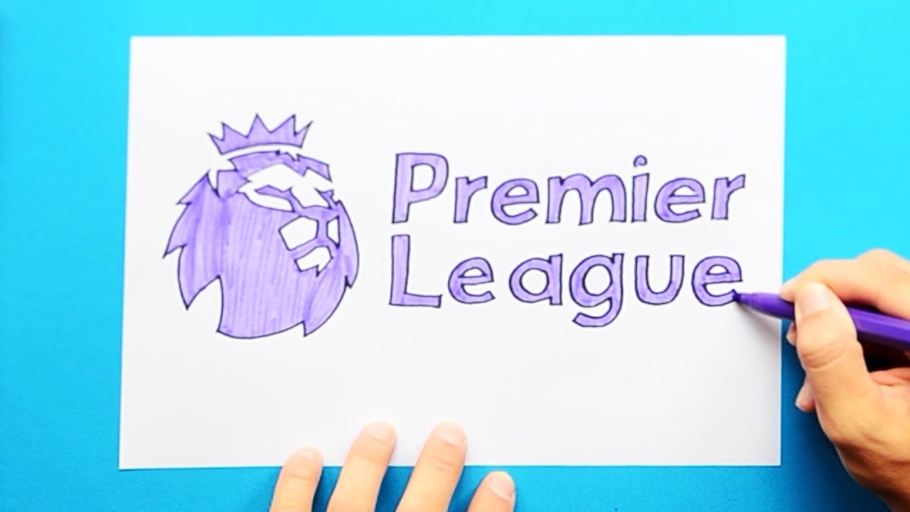
England's football league is widely regarded as one of the best in the world, and it has some of the world's greatest players competing against each other to raise the bar. Throughout the several logo redesigns, the lion has been a recurring theme. This is because lions represent strength, power, and bravery.
When it came to logos, there was no evidence that sports fans were resistant to change or steadfast in their devotion to what they knew. It appears that they do as long as the product is outstanding.
The cherry on top: tips and tricks to create a successful sports logo
Sharpen the corners of your objects.
In design, straight lines are a popular choice because of their attractiveness to the human eye. Their presence lends a particular "feeling" or "vibe" to certain forms. Circular forms, such as circles, are perceived as funny since the eye is constantly looping back and forth,
When the eye initially encounters sharp points, it may be alarmed, yet the eye is immediately drawn to turn around and run oppositely. This is the nature of things with sharp edges. This not only enhances the visual appeal of a photograph but also draws the audience's attention.
Focus on the typefaces you use.
Excellent typography is a must-have when creating a sports logo. T-shirts and other clothing items frequently lose their brand attractiveness in the manufacturing process. The only thing that may speak for your club in many circumstances is its name. The importance of a well-designed typeface cannot be overstated.
Sharp points may be added to your letters to maintain a high degree of energy and emotion during the writing process. This practice of "spiking" serifs is rather widespread. You'll discover more typographic patterns if you examine a huge number of sports symbols.
Don't be scared to appear aggressive to get your point across
Many sports teams use violent mascots as the basis for their logo designs. A large and dangerous animal, such as a bear or a large cat, is typically the culprit. Remember that humans are a potentially lethal species in and of themselves. Instead of a vicious animal, many teams opted for a well-known character with a reputation for either combat prowess or simply being frightening. The Spartans, Romans, and ninjas are the most common, while others include pirates, ninjas, and medieval knights.
No matter how prevalent this trend becomes, you won't be able to change the name of your favorite team. There are various ways to make your mascot appear more threatening, although it may not be possible to alter its design entirely.
Decide on a sport
They don't have to prove anything to anyone. Getting the word out about your participation in a particular sport is an absolute necessity in the beginning.
As a means of clearly stating what you do and who you are, including symbols in your logo design can be particularly effective for smaller organizations. While saying the obvious is OK, you are free to be creative with a baseball or other thing.
The significance of a well-chosen wording
Logo framing has a long and rich history. An overall cohesive design can be achieved by framing the logo's visual and linguistic components, making it more appealing.
Another less clear connotation is subtly conveyed in the text. That's why it's perfect for sports, which are about community building. Supporters of a team are more inclined to stick with the team if the logo is enclosed in a frame.
Using circles in frames is a common practice in other industries since they are viewed as more welcoming and warm. When it comes to designing sports team logos, a more aggressive and invigorating look is recommended. Strength and leadership can be conveyed in many ways, including through the use of shields and pyramids, which are classic emblems of these qualities.
After reading this article, you should better understand sports logos. Create your own from scratch, and you're done! Are you ready to begin? To make your journey easier, here's a website where you can find the best sports font for your logo. Create something beautiful and enjoy yourself while you're at it!






Customer questions & answers